From Wireframes to Workflows: Why UI Is the Last Step
Design teams often reach for Figma too early.
We open a blank canvas, sketch wireframes, debate layouts, and polish visuals—only to realize later that the product feels clumsy, hard to scale, or operationally fragile. Not because the UI is bad, but because the system underneath it was never fully understood.
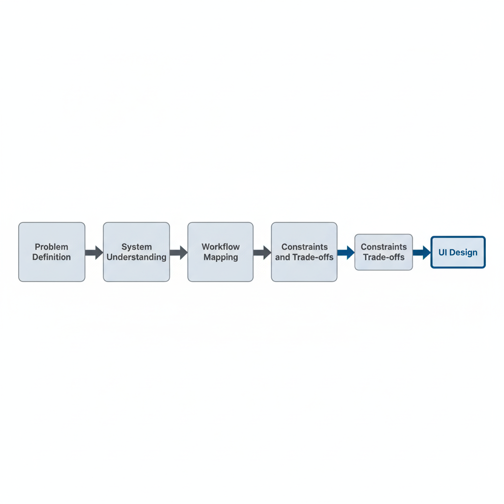
In my experience as an industrial and operations engineer turned design engineer, I've learned that UI is rarely the starting point. It's the final outcome of decisions made much earlier—about workflows, people, constraints, and trade-offs.
Design Is a System Before It's an Interface
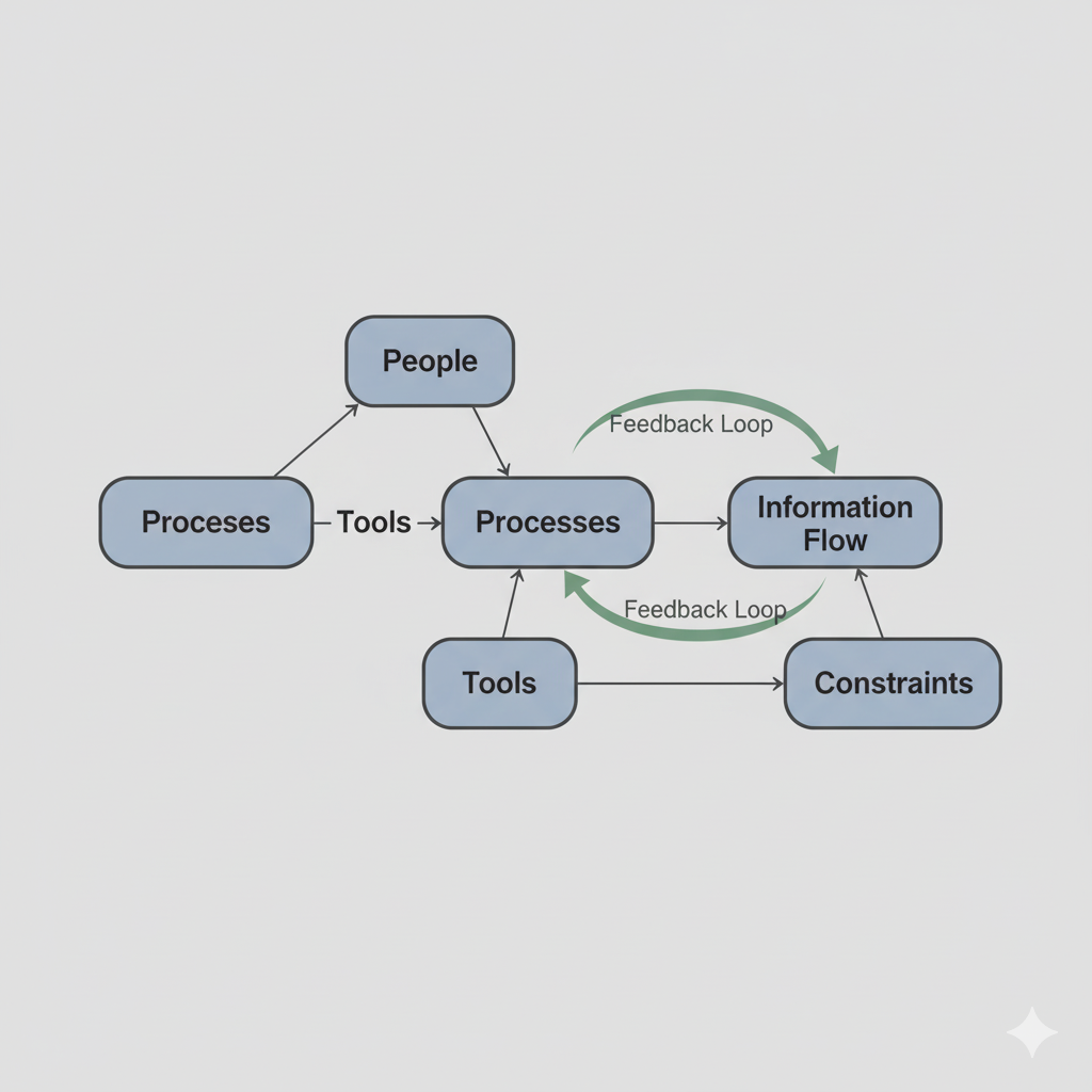
Every product is part of a larger system:
- People performing tasks
- Information moving between roles
- Decisions being made under time and cognitive pressure
- Constraints around cost, capacity, and quality
When we skip system thinking and jump straight into wireframes, we end up designing screens instead of solutions.
Industrial engineering taught me to always ask:
- What is the full end-to-end flow?
- Where does work slow down?
- Where does responsibility become unclear?
- Where does human effort get wasted?
Only after answering these questions does UI start to make sense.
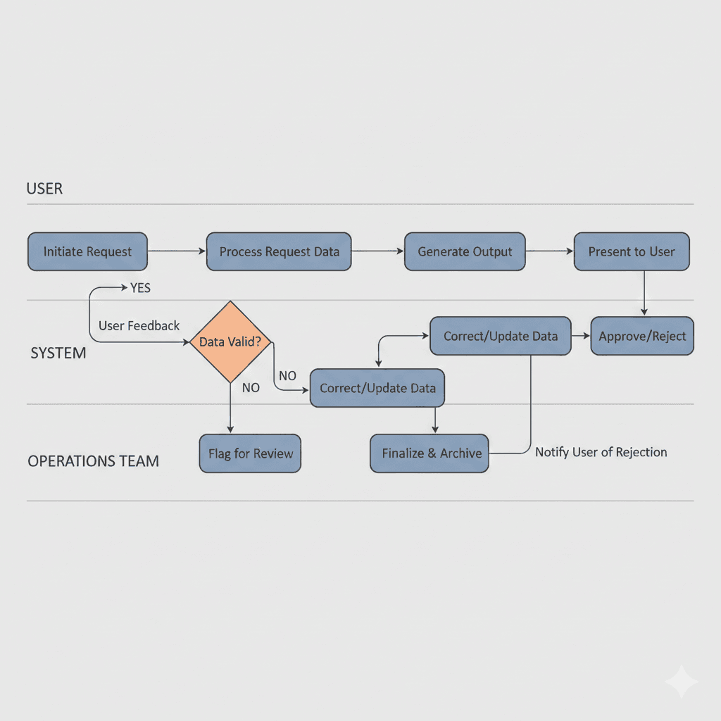
Wireframes Without Workflow Are Guesswork
Wireframes are representations of decisions—not decisions themselves.
Without understanding:
- Who uses the system
- What triggers their actions
- What happens before and after each step
- What errors, delays, or edge cases exist
…wireframes become assumptions disguised as structure.
This is where AI plays a critical role in my workflow.
Using AI to Map Workflows Before Designing Screens
Before touching UI, I use AI to help:
- Map user and operational flows
- Identify missing states (empty, error, loading, handoff)
- Stress-test scenarios under scale or pressure
- Surface hidden dependencies between teams or systems
Instead of asking AI to "design a dashboard," I ask it to:
- Break down how work actually moves
- Highlight friction points
- Identify where users hesitate or context switches occur
This mirrors how I approached process optimization as an operations engineer—only faster and more iteratively.
UI as a Constraint-Solver, Not Decoration
When workflows are clear, UI has a specific job:
- Reduce cognitive load
- Shorten decision time
- Make the next action obvious
- Prevent costly mistakes
Good UI doesn't add clarity—it reveals clarity that already exists in the system.
Bad UI often tries to compensate for:
- Poor process design
- Unclear ownership
- Overloaded users
- Broken handoffs
No amount of visual polish can fix a broken workflow.
Metrics Change How You Design
Because of my industrial engineering background, I naturally think in operational metrics—even when designing interfaces.
I design with questions like:
- Does this reduce cycle time?
- Does this increase throughput?
- Does this lower rework?
- Does this prevent overload on a single role?
- Does this make system health visible?
AI helps me model and reason about these trade-offs early, before they turn into expensive redesigns.
Why UI Comes Last
When workflows are solid:
- UI decisions become obvious
- Complexity reduces naturally
- Fewer screens are needed
- Edge cases are already accounted for
UI becomes the expression of a well-designed system—not a patch for its flaws.
As a design engineer, my goal isn't to design more screens. It's to design better flows, clearer decisions, and more resilient systems.
The interface is simply where all of that thinking becomes visible.